So, You Think Paint is Just for Walls? Think Again.
Let’s be honest. As a retail store owner, you make about a million decisions before you’ve even had your first cup of coffee. Which supplier is late this time? Is that new window display attracting customers or just confusing pigeons? And, most importantly, where did you leave the pricing gun?
Amidst this beautiful, caffeinated chaos, it’s easy to overlook one of the most powerful, persuasive, and—dare we say—sneaky tools in your arsenal: color. You probably spent a fair bit of time choosing your store’s paint color, agonizing over “Eggshell White” versus “Slightly-Less-Eggy-Shell White.” But what if we told you that your color choices, from your walls to your price tags, could be silently steering your customers’ wallets?
Color theory isn't just for art students and pretentious graphic designers. It’s a psychological powerhouse that, when wielded correctly, can influence mood, guide attention, and nudge shoppers from “just browsing” to “just bought.” It’s time to stop thinking of color as decoration and start treating it like the master salesperson it is.
The Psychology of Hues (Without Needing a Ph.D.)
Every color whispers a little something to our subconscious. Understanding these messages is like learning a secret language that your customers already speak. Don’t worry, there won’t be a quiz, but taking a few notes might just boost your bottom line.
Red, Orange, and Yellow: The "BUY NOW OR REGRET IT FOREVER!" Colors
These are the warm, energetic colors that scream for attention. They create a sense of urgency, excitement, and—if overused—mild anxiety. Think of them as the extroverts of the color wheel. A study from the University of Winnipeg found that up to 90% of snap judgments made about products can be based on color alone.
- Red: The undisputed king of urgency. It increases heart rate and makes people feel bold. This is why “CLEARANCE,” “SALE,” and “STOP” signs are almost universally red. Use it for your call-to-action areas, but sparingly. You want to create urgency, not a city-wide emergency.
- Orange: A bit friendlier than red, orange is cheerful, confident, and energetic. It’s great for motivating action, like “Sign Up Here” or “Add to Cart.” It feels accessible and affordable.
- Yellow: The happiest color, right? It grabs attention faster than any other color. It’s associated with optimism and youthfulness. Perfect for window displays to snag the attention of passersby or to highlight a specific, must-see product. Just be warned, too much yellow can be straining on the eyes. No one wants to shop in a store that feels like staring into the sun.
Blue, Green, and Purple: The "Relax, We’ve Got This" Colors
If the warm colors are shouting, the cool colors are having a calm, reassuring conversation. They build trust, suggest quality, and encourage shoppers to slow down and spend more time (and money) in your store.
- Blue: The color of trust, security, and dependability. It’s why so many banks, tech companies, and corporate giants use it. A splash of blue near your checkout counter or in areas where you display high-value items can subconsciously reassure customers that they’re making a smart, secure purchase.
- Green: Universally associated with nature, health, and tranquility. It’s the easiest color for the eye to process. If you sell eco-friendly products, wellness items, or just want to create a calming oasis, green is your go-to. It signals to shoppers that they can relax and take their time.
- Purple: Historically linked to royalty, purple communicates luxury, wisdom, and quality. It’s perfect for high-end boutiques, beauty brands, or any store wanting to project an image of sophistication and premium value.
Black, White, and Gray: The Sophisticated Minimalist (or Just Indecisive?)
These neutrals are the foundation of any good color palette. They are the definition of classic, modern, and sleek. Use them to create a sense of luxury, to make your products pop, or to provide a clean backdrop that isn’t distracting. Black screams power and elegance, white suggests simplicity and modernity, and gray is the mature, stable friend that holds everything together. A luxury brand might use a primarily black-and-white scheme to make their colorful products the star of the show.
Amplifying Your Palette with a Digital Touch
So you’ve painted a brilliant blue accent wall and designed eye-catching red sale tags. Fantastic. But how do you ensure every single customer notices and understands the visual cues you’ve so carefully crafted? In a busy store, even the best-laid plans can get lost in the shuffle. This is where a little bit of tech can amplify your efforts and bridge the gap between your design and your customer’s attention span.
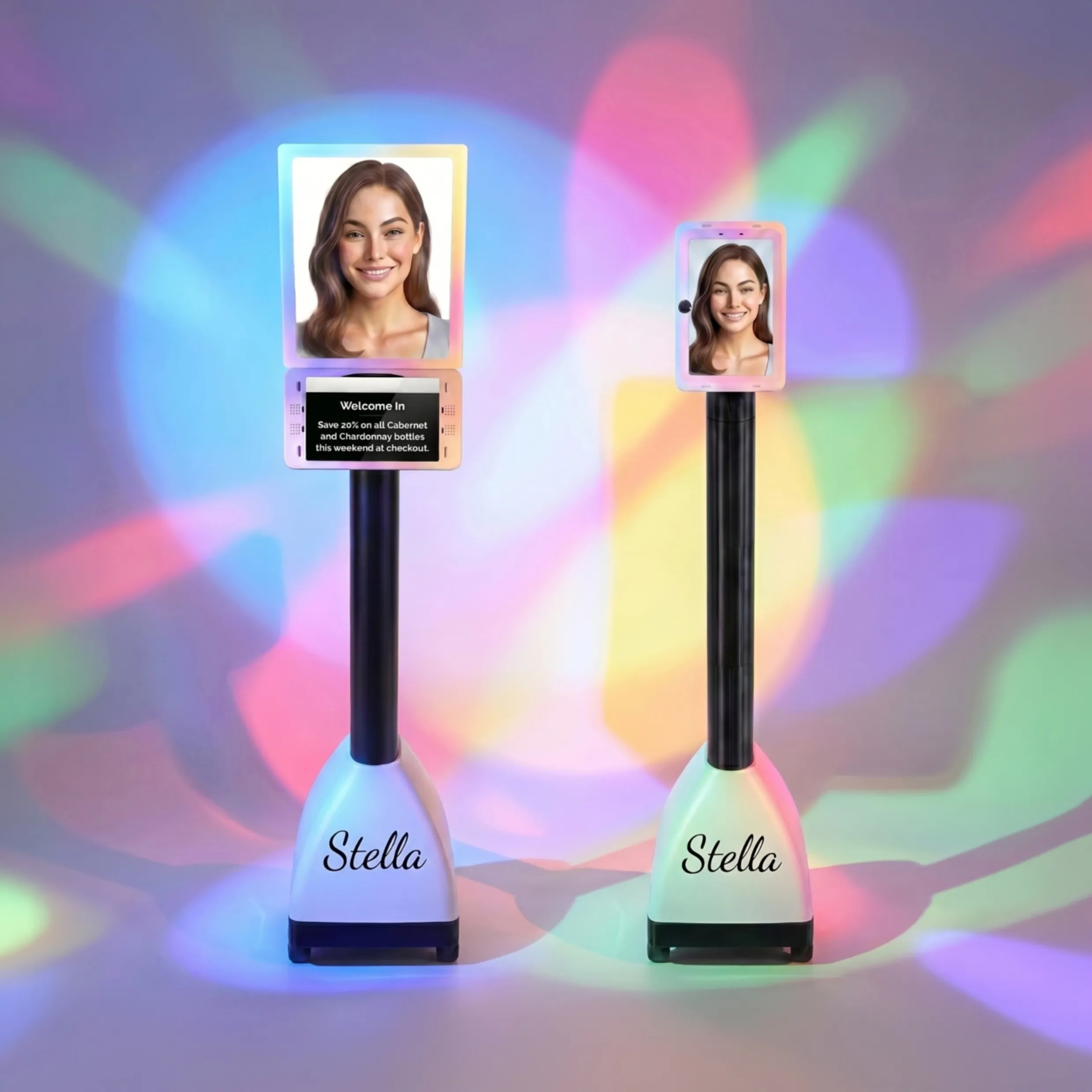
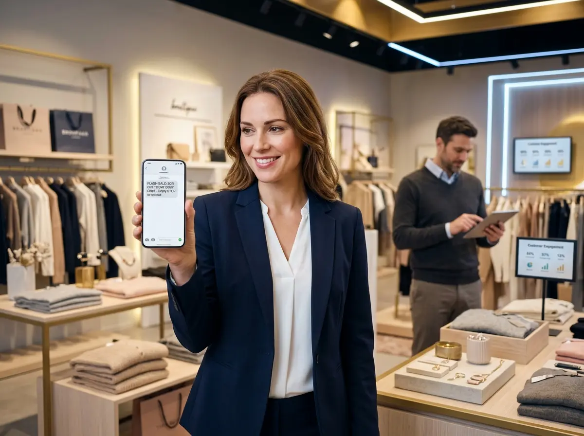
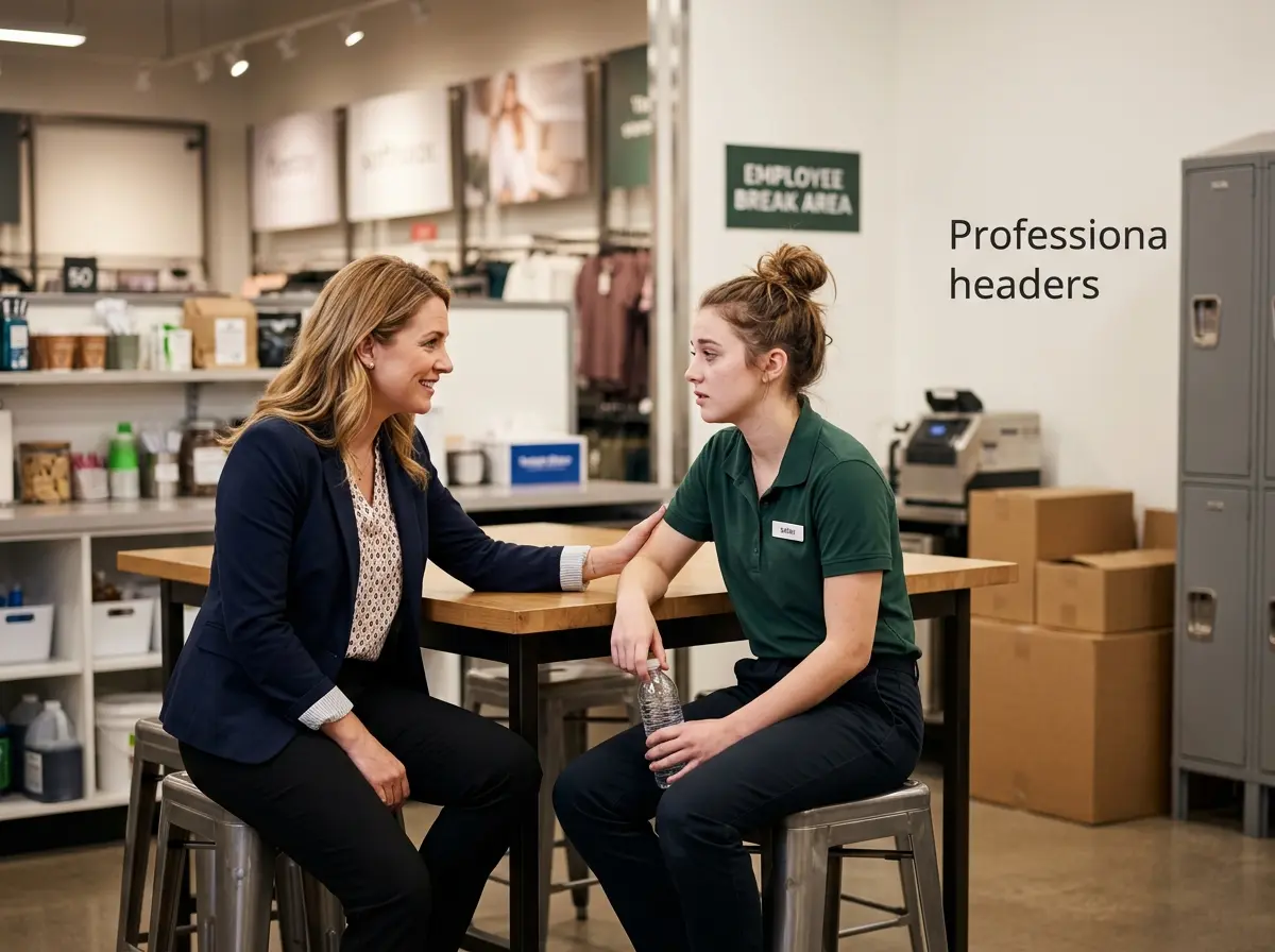
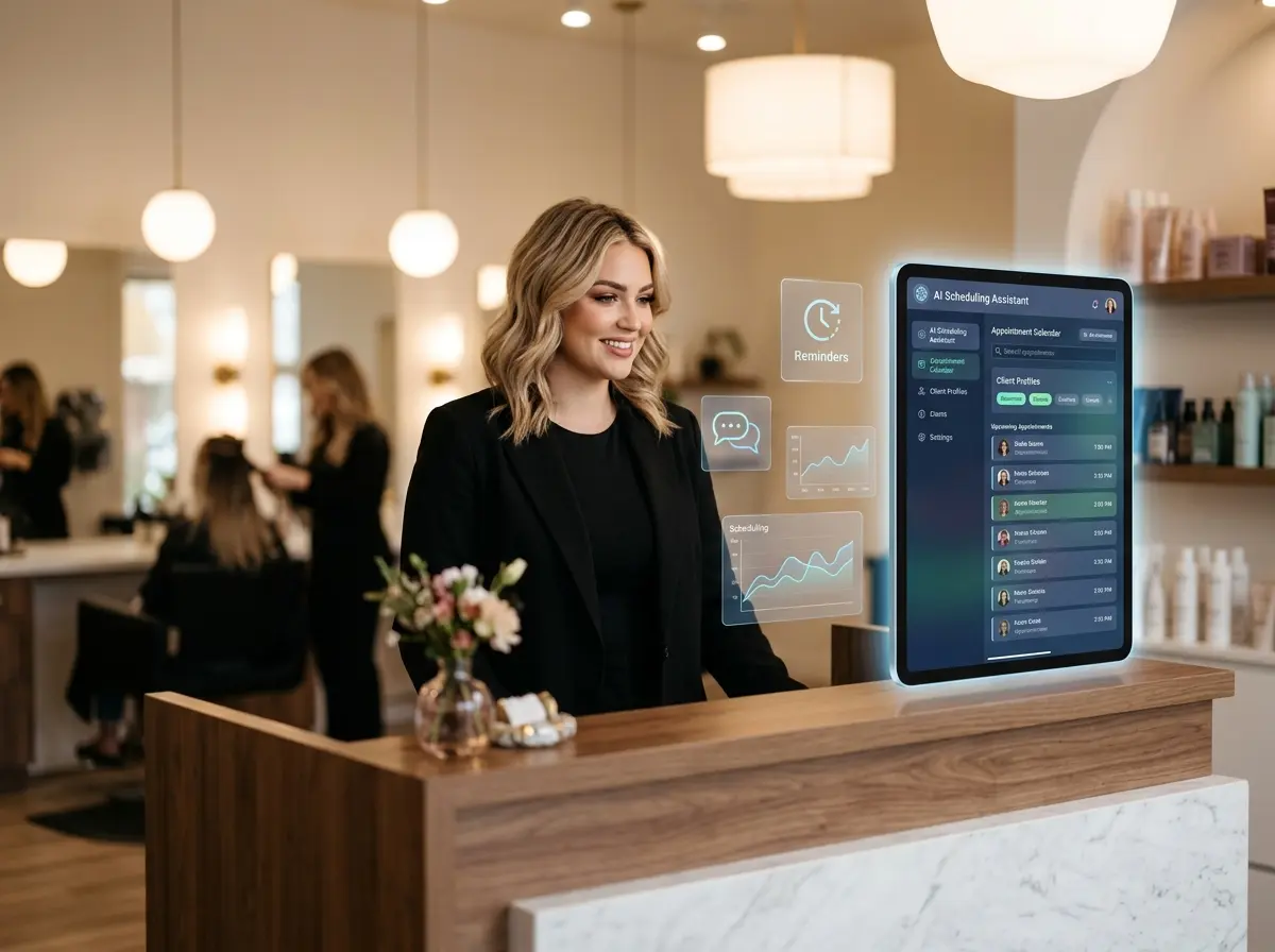
Your In-Store Greeter: More Than Just a Friendly Face
Imagine a team member at your entrance whose sole job is to reinforce your strategy. That's where an in-store robotic assistant comes in. Let’s say you’re using green tags to highlight your new eco-friendly product line. Your human staff might be busy with other customers, but a dedicated greeter can be programmed to call attention to it. For example, Stella can greet shoppers with, “Welcome! Be sure to check out our new sustainable collection—just look for the green tags throughout the store!”
This simple, verbal cue instantly connects your color strategy to a tangible action for the customer. It transforms a passive design choice into an active part of the sales process. Suddenly, your green tags aren’t just sitting there hoping to be noticed; they’re part of a guided shopping experience. You can even customize the interface on an assistant like Stella to match your store’s primary and accent colors, creating a seamless, branded experience from the moment a shopper walks in.
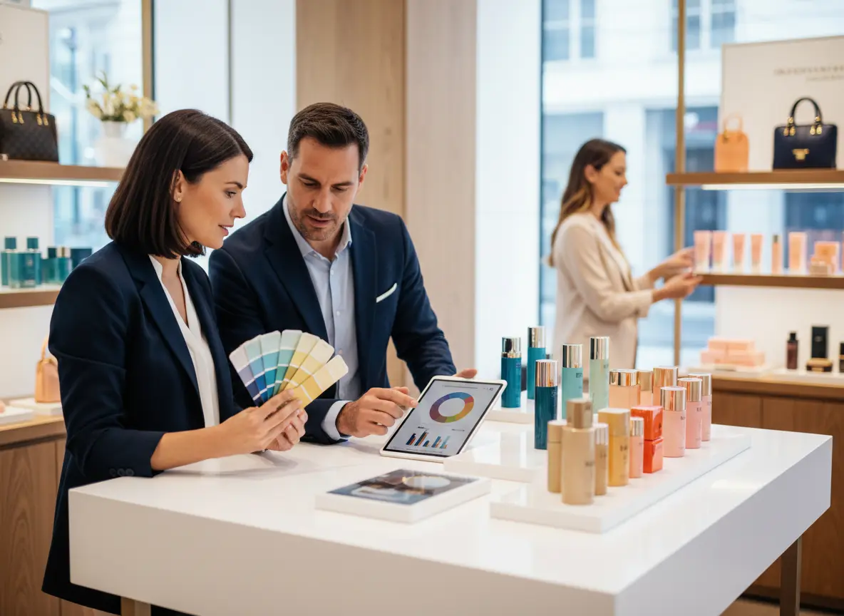
Beyond the Paint Swatches: Practical Color Strategies
Okay, theory is great, but let’s get down to brass tacks. How do you apply this in a way that doesn’t require you to close for a week and hire a team of designers who use words like “juxtaposition” without a hint of irony?
The 60-30-10 Rule: Your New Best Friend
This is a classic interior design rule that works wonders for retail. It’s a simple formula to create a balanced and visually appealing color scheme.
- 60% Dominant Color: This is your main background color. Think walls, floors, and large fixtures. It should be a neutral or a softer shade that sets the overall mood (e.g., a calming light gray or a warm beige).
- 30% Secondary Color: This color should contrast with your dominant color and is used for things like accent walls, furniture, or key display areas. It’s there to create interest and guide the eye.
- 10% Accent Color: This is your pop of color. It should be bold and used sparingly for things you really want customers to notice—sale signs, call-to-action buttons, or a specific promotional display. This is where your urgent reds and attention-grabbing yellows come into play.
Color Coding for Navigation (and Sanity)
Use color to create a "visual map" of your store. Are your departments clearly defined? A subtle shift in color can guide customers intuitively. For example, a home goods store might use a soothing green in the garden section, a warm terracotta in the kitchen department, and a cool blue in the bedding area. This makes navigating a large space less intimidating and helps shoppers find what they’re looking for without having to hunt down an employee. It's an effortless way to improve the customer experience.
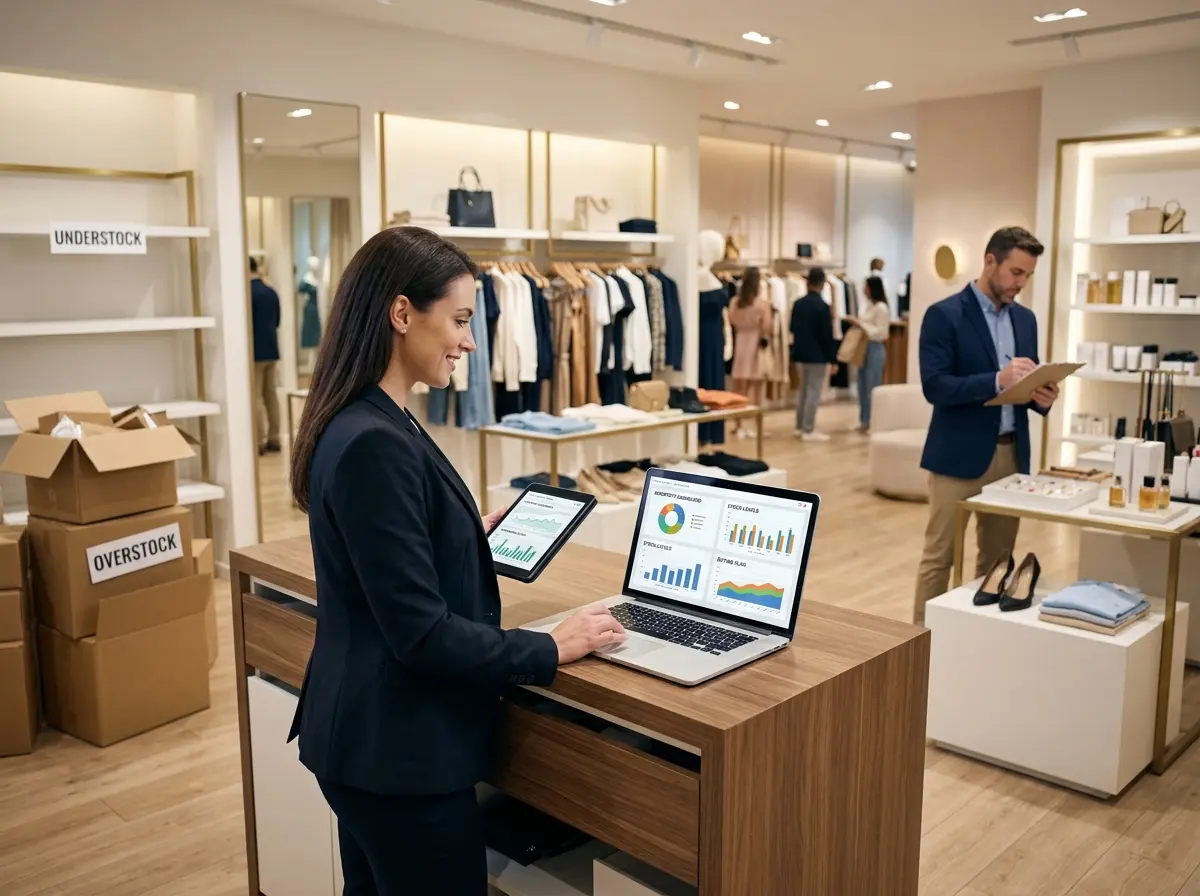
A/B Testing Your Colors (Yes, You Can Do This)
You don't need a fancy analytics team to test what works. Try a simple experiment. For one week, make all your "Limited Time Offer" signs bright red. The next week, change them to a vibrant orange. Track your sales or even just ask your staff which version seemed to get more attention. Was there a noticeable difference in how many people stopped to look? This kind of real-world data is invaluable and costs you nothing but a few sheets of colored paper. The results might just surprise you.
A Quick Reminder About Your New Favorite Employee
While you’re busy masterminding your store’s color psychology, remember that consistent execution is key. That’s why a tool like Stella is so valuable; she’s your reliable brand ambassador, greeting every customer, promoting exactly what you want, and reinforcing your sales strategies 24/7 without ever needing a coffee break.
Conclusion: Go On, Be a Color Mastermind
Color is so much more than a cosmetic choice; it’s a silent, tireless member of your sales team. It can calm, excite, build trust, and create urgency, all before a single word is spoken. By being intentional with your palette, you’re not just making your store look good—you’re creating an environment that is strategically designed to sell.
So here’s your homework. The next time you walk into your store, stop at the entrance and look around. Don’t just see walls and shelves. See a canvas. Ask yourself: What story are my colors telling? Is it the right one? If not, a trip to the paint store might just be the most profitable decision you make all week.