Your Contact Form Is Losing You Money (And You Don't Even Know It)
Let's paint a familiar picture: a potential client lands on your website, scrolls through your beautifully crafted service pages, gets genuinely excited about working with you — and then hits your contact form. It asks for their name, email, and a vague "message" box. They stare at it. They think, "What do I even write here?" They close the tab. You never hear from them.
This scenario plays out thousands of times a day across service-based businesses, and the tragic part is that most business owners never even realize it's happening. You're not losing leads because your services aren't good enough. You're losing them because your contact form is doing the bare minimum — and in today's competitive landscape, bare minimum doesn't convert.
A well-designed contact form isn't just a digital suggestion box. It's the front door of your sales process, the first impression of your professionalism, and — when done right — a powerful tool for qualifying leads, setting expectations, and reducing the back-and-forth that eats up your valuable time. Let's talk about how to make yours actually work.
What Makes a Contact Form Convert
Ask the Right Questions (Not Just the Easy Ones)
The classic name-email-message trifecta is comfortable, but it's not particularly useful. When a prospective client submits a form with nothing but "Hi, I'm interested in your services," you're stuck playing 20 questions before you can even assess whether they're a good fit. That's friction — for both of you.
Instead, design your form around the information you actually need to have a productive first conversation. For a marketing agency, that might mean asking about their current monthly budget range, their primary business goal, or whether they've worked with an agency before. For a law firm, it might mean asking the type of legal matter they're dealing with and their timeline. For a spa or salon, it might be as simple as which service they're interested in and their preferred appointment window.
The key is to strike a balance. Ask enough questions to qualify the lead and prepare for the conversation, but don't turn your form into a dissertation. Five to eight targeted fields is typically the sweet spot for service-based businesses. Studies have shown that forms with three to five fields tend to generate higher submission rates, while forms with more fields — when they're the right fields — generate higher quality leads. Quality over quantity, always.
Write Form Copy That Actually Communicates
Here's something most business owners overlook entirely: the words on and around your contact form matter enormously. The heading above your form, the placeholder text inside the fields, the button label, and the confirmation message after submission — all of it shapes how a visitor feels about reaching out.
Compare these two button labels: "Submit" versus "Send My Request." The first feels like filing a tax form. The second feels like taking an action with a purpose. Small tweak, real difference.
Similarly, the text above your form should manage expectations and reduce hesitation. Something like: "Fill out the form below and we'll get back to you within one business day — no sales pressure, just a straightforward conversation about your needs." That single line reduces anxiety, sets a timeline, and positions you as a low-pressure professional. The confirmation message after submission is also prime real estate — use it to tell them exactly what happens next, so they're not left wondering if their message disappeared into the void.
Placement, Design, and Mobile Optimization
Your contact form could be perfectly written and still underperform simply because nobody can find it — or because it looks terrible on a smartphone. More than 60% of web traffic now comes from mobile devices, and a form that requires pinching, zooming, or accidentally tapping the wrong field is a form that doesn't get submitted.
Keep fields large enough to tap comfortably, use a single-column layout on mobile, and make sure your form loads quickly. On the design side, reduce visual clutter around the form itself so the eye naturally travels there. And on placement: yes, you should have a dedicated Contact page, but consider also placing abbreviated versions of your form — or strong calls-to-action linking to it — on your service pages, your homepage, and anywhere else a visitor might be ready to take the next step.
Automating the Follow-Up So Leads Don't Go Cold
The First Hour Is Everything
Here's a statistic worth tattooing somewhere visible: businesses that respond to leads within five minutes are 100 times more likely to connect with them than those that wait 30 minutes or longer. Let that sink in. A lead who fills out your contact form at 7:00 PM on a Tuesday isn't going to wait around patiently for your 9:00 AM response. They've already submitted two other forms by the time you pour your morning coffee.
This is where automation earns its keep. At minimum, set up an immediate automated email acknowledgment that confirms receipt, sets a response timeline, and ideally includes something of value — a link to your FAQ page, a brief overview of your process, or a calendar link if you use online scheduling. This buys you time, demonstrates professionalism, and keeps the lead warm while they wait for the human follow-up.
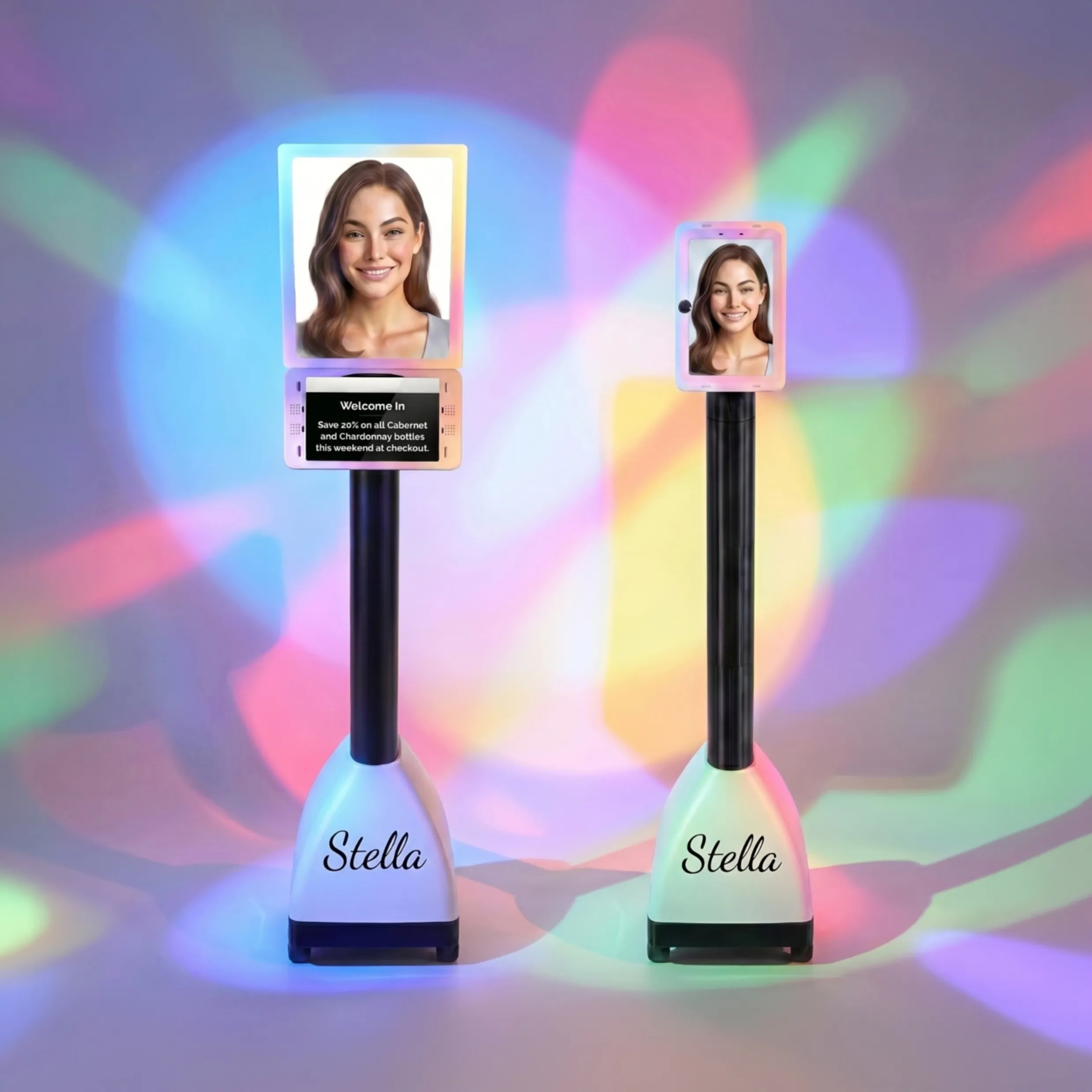
How Stella Can Help Bridge the Gap
Stella — the AI robot employee and phone receptionist — is particularly well-suited to help service-based businesses stay responsive without burning out their staff. Her built-in intake forms can collect lead information conversationally during phone calls or directly through your website, feeding everything neatly into her integrated CRM with AI-generated contact profiles, custom fields, tags, and notes. When a prospective client calls after hours wondering about your services, Stella doesn't send them to voicemail and hope for the best — she engages them, gathers their information, and makes sure your team wakes up to a qualified lead summary with a push notification, not a garbled voicemail they'll listen to twice and still misunderstand.
Whether your business has a physical location where Stella can greet walk-in prospects at her in-store kiosk, or you're a solopreneur who simply needs every phone inquiry handled professionally, the combination of a strong contact form and a capable AI receptionist creates a seamless intake experience that works around the clock.
Optimizing Your Form Over Time
Track What's Happening (Because Assumptions Are Expensive)
A contact form isn't a set-it-and-forget-it tool — it's a living part of your sales process that deserves the same analytical attention you'd give any other marketing asset. At minimum, you should be tracking your form completion rate (how many people start filling it out versus how many actually submit it) and your conversion rate (how many submissions turn into actual clients or booked consultations).
If your completion rate is low, the form itself is likely the problem — too long, too confusing, or poorly designed. If your completion rate is fine but your conversion rate is low, the issue might be the quality of questions you're asking, your follow-up process, or how well you're qualifying leads before they even reach the form. Tools like Google Analytics 4, Hotjar, or even basic heatmapping software can show you where users are dropping off, which fields cause hesitation, and whether your form is even being seen in the first place.
A/B Test Like You Mean It
Testing doesn't have to be complicated. Start with one variable at a time: try changing your button copy from "Submit" to "Get My Free Consultation" and run both versions for a few weeks. Test the form in two different locations on the same page. Try a short form versus a slightly longer one and see which generates leads that are better prepared for the sales conversation.
Even small improvements compound over time. If your contact form currently converts at 2% of visitors and you nudge it to 3% through smart testing and iteration, that's a 50% increase in leads — from the same traffic, without spending an extra dollar on advertising. That's the kind of math that should make every business owner sit up a little straighter.
Revisit Your Form as Your Business Evolves
Your services change. Your ideal client changes. Your pricing, process, and offerings evolve. Your contact form should evolve with them. Set a calendar reminder every quarter to review your form and ask: does this still reflect how we work? Are we still asking the most useful questions? Have we added a new service that deserves its own intake path? Keeping your form current ensures that every lead arrives in your inbox with relevant, accurate expectations already set — which makes the entire sales process smoother for everyone involved.
A Quick Reminder About Stella
Stella is an AI robot employee and phone receptionist designed to help businesses of all sizes stay responsive, professional, and organized — without hiring additional staff. She answers phone calls 24/7, greets customers at her in-store kiosk, collects lead information through conversational intake forms, and manages everything through a built-in CRM. At just $99/month with no upfront hardware costs, she's built for businesses that want enterprise-level responsiveness without the enterprise-level overhead.
Your Next Steps Toward a Form That Actually Works
The good news is that improving your contact form is one of the highest-ROI changes you can make to your website — and it doesn't require a developer, a big budget, or a complete redesign. It requires clarity about who you're trying to attract, intentionality about the information you need from them, and a commitment to responding quickly and professionally once they do reach out.
Start here: pull up your current contact form right now and ask yourself honestly whether it would make you want to fill it out. Does it feel easy and reassuring, or does it feel like homework? Does it ask the questions that would actually help you serve someone better — or is it just there because your website template came with one?
Then take these concrete steps:
- Audit your current form — review every field and cut anything that isn't earning its place.
- Rewrite your surrounding copy — add a clear headline, expectation-setting language, and a confirmation message that continues the conversation.
- Check your mobile experience — submit the form yourself from your phone and time how long it takes.
- Set up or improve your automated response — make sure every submission gets an immediate, helpful acknowledgment.
- Start tracking — set up basic analytics so you can measure and improve over time.
Your contact form is often the last thing standing between a curious visitor and a paying client. Treat it accordingly, optimize it consistently, and make sure your follow-up process is as polished as the form itself. Because all the traffic in the world doesn't mean much if the door you're sending people through leads nowhere.