Your Contact Form Is Losing You Money (But It Doesn't Have To)
Let's be honest: most contact forms are an afterthought. They sit quietly at the bottom of a website like a sad suggestion box in a break room that nobody checks. You spent weeks perfecting your homepage copy, obsessing over your brand colors, and writing a "About Us" page that really captures your essence — and then your contact form just says "Name, Email, Message. Submit." And that's supposed to convert visitors into paying clients?
For service-based businesses especially, your contact form is often the first real interaction a potential customer has with your process. It sets the tone. It either makes them feel like they're in capable hands, or it makes them wonder if they should just call your competitor down the street. The good news is that a high-converting contact form isn't rocket science — it just requires a little intention and a willingness to stop treating it like digital wallpaper.
This guide walks you through exactly what makes a contact form work, what tanks conversions, and how to build a form that actually moves people from "just browsing" to "ready to book."
Why Most Contact Forms Fail (And What to Do Instead)
The "Too Much, Too Soon" Problem
One of the most common mistakes service businesses make is treating the contact form like an intake questionnaire. They ask for the customer's name, email, phone number, budget, project timeline, preferred contact method, how they heard about you, and whether they'd like to be added to the newsletter — all before the person has any idea if you're even the right fit for them.
This is the digital equivalent of a first date where you immediately ask about marriage and children. It's too much, too fast, and it sends people running. Research consistently shows that reducing form fields increases conversions. In fact, forms with three fields or fewer can convert up to 25% better than longer versions. For an initial contact form, you really only need three things: a name, a contact method, and a brief reason for reaching out. Save the deep-dive questions for your onboarding process.
Vague CTAs That Nobody Clicks With Confidence
Your submit button should not say "Submit." Nobody is excited to submit anything. It sounds like homework. Instead, use action-oriented language that tells the visitor exactly what happens next — something like "Request My Free Consultation," "Get a Custom Quote," or "Start My Project." This small change sets expectations and makes the next step feel like a benefit, not a chore.
The same principle applies to your form headline. Instead of "Contact Us," try "Let's Talk About Your Project" or "Tell Us What You Need — We'll Get Back to You Within 24 Hours." That kind of specificity builds trust before a single word has been exchanged.
No Follow-Through After Submission
If someone fills out your contact form and lands on a generic "Thanks, we'll be in touch!" page, you've just created a vacuum of uncertainty. They have no idea when you'll respond, what the process looks like, or whether anyone will actually reach out. A high-converting form experience doesn't end at the submit button. It immediately reassures the visitor with a confirmation that includes a realistic response timeframe, a brief outline of what happens next, and ideally a way to reach you faster if they prefer. A well-crafted thank-you page can also be a surprisingly effective place to offer a resource, a special promotion, or an invitation to follow you on social media — so don't waste it.
Smarter Intake Starts With Smarter Tools
Let Technology Do the Heavy Lifting
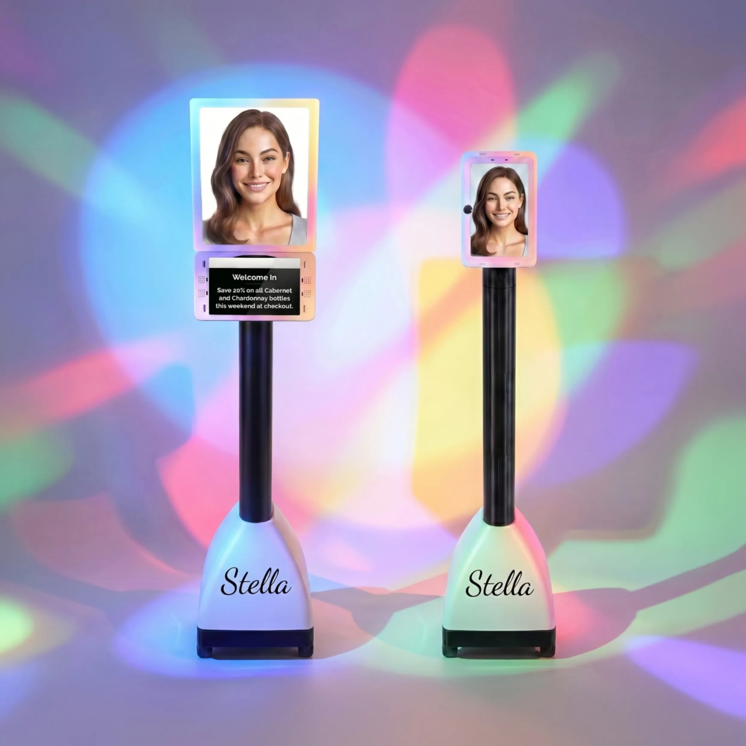
Here's a thought: what if your contact form wasn't just a form, but the beginning of a fully automated intake process? That's where tools like Stella, the AI robot employee and phone receptionist, come into play. Stella collects customer information through conversational intake forms — not just on your website, but also during phone calls and at her in-store kiosk for businesses with a physical location. Instead of a static form that just emails you a submission, Stella captures structured data and feeds it directly into a built-in CRM with custom fields, tags, notes, and AI-generated customer profiles.
For service-based businesses juggling consultations, appointments, and follow-ups, this kind of automated intake can be a genuine game-changer. Stella handles the information gathering so that by the time a lead reaches you, you already know who they are, what they need, and where they are in the decision-making process. That's the kind of first impression that converts — and it runs 24/7, without a coffee break in sight.
Designing a Form That Actually Converts
Match the Form to the Stage of the Journey
Not all contact forms serve the same purpose, and designing them as if they do is a missed opportunity. A visitor who just discovered your business needs a very different experience than a returning customer looking to book a follow-up service. Consider having multiple forms for different contexts: a short "Get in Touch" form for general inquiries, a slightly more detailed "Book a Consultation" form for warmer leads, and a thorough intake form for clients who are ready to get started.
This approach respects where the customer is in their journey. It also allows you to segment your leads from the very first touchpoint, which makes your follow-up communication far more relevant — and relevant communication converts significantly better than generic responses.
Use Conditional Logic to Personalize the Experience
Conditional logic — where certain questions appear based on previous answers — allows you to gather more information without overwhelming visitors with a wall of fields. For example, if a visitor selects "I need a quote" from a dropdown, the form could then reveal a few targeted questions relevant to that request. If they select "I have an existing project question," a completely different set of fields appears.
This makes the form feel personalized and intelligent rather than one-size-fits-all. Most modern form builders support conditional logic, and the time investment to set it up is absolutely worth the improvement in lead quality. A prospect who has answered three to five relevant questions is a much warmer lead than someone who typed "interested in your services" into a blank text box.
Mobile Optimization Is Non-Negotiable
Over 60% of web traffic now comes from mobile devices, and yet so many contact forms are clearly designed for desktop and ported awkwardly to smaller screens. Tiny tap targets, fields that require horizontal scrolling, and submit buttons that fall below the fold are all conversion killers. Test your form on multiple devices before you consider it done. Better yet, design it mobile-first and then scale up for desktop.
Pay attention to keyboard behavior, too. Phone number fields should trigger a numeric keyboard. Email fields should trigger one with an "@" key ready to go. These small UX details signal professionalism and reduce friction — two things that matter enormously when someone is deciding whether to trust you with their business.
Quick Reminder About Stella
Stella is an AI robot employee and phone receptionist built for businesses of all sizes — whether you have a storefront, work entirely online, or both. She greets walk-in customers at a physical kiosk, answers phone calls 24/7, handles intake, and manages leads through a built-in CRM, all for just $99 a month with no upfront hardware costs. If your contact form is doing some of the work, Stella handles everything else — so no lead ever falls through the cracks.
Turn Your Contact Form Into a Conversion Engine
A great contact form is not a passive thing. It's an active part of your sales process, and treating it that way will have a measurable impact on your bottom line. Here's a quick checklist to get you started:
- Audit your current form. Count the fields. If you have more than five for an initial inquiry, cut it down. Ask only what you need to start a meaningful conversation.
- Rewrite your submit button. Make it specific, benefit-driven, and action-oriented. "Send My Request" or "Book My Free Call" beats "Submit" every single time.
- Build a real confirmation page. Tell visitors what to expect, when to expect it, and what the next step looks like. Uncertainty kills momentum.
- Implement conditional logic. Use it to gather smarter information without increasing perceived form length.
- Test on mobile. Right now. Go grab your phone and fill out your own contact form. You may be surprised by what you find.
- Integrate your form with your CRM. Manual data entry is where lead information goes to die. Automate the handoff so every submission becomes an organized, actionable contact record.
Your contact form is working around the clock on your behalf — it just may not be working well. With a few strategic adjustments, it can become one of the most reliable client acquisition tools in your entire business. And when you combine a well-optimized form with a smart intake system, you're not just capturing leads. You're building a pipeline that practically runs itself.
That's the kind of efficiency every service business owner deserves — and frankly, it's long overdue.