Your Menu Is Lying to Your Customers (And Not in the Fun Way)
Here's a humbling truth: your customers almost never order what they actually want. They order what your menu tells them to want. And if your menu is just a laminated list of items with prices slapped next to them, congratulations — you've accidentally designed one of the most powerful cost-cutting tools in the restaurant industry. Unfortunately, it's cutting your revenue, not your expenses.
Menu psychology is a real, well-researched discipline, and the restaurants that understand it consistently outperform those that don't. Studies from Cornell University's Center for Hospitality Research have shown that strategic menu design can increase profits by 15% or more — without changing a single recipe, hiring a new chef, or running a single promotion. The secret isn't manipulation (well, not the bad kind). It's understanding how your customers' eyes and brains move through a page, and guiding them — gently, gracefully — toward the selections that are best for them and for your bottom line.
Let's break down the psychology, the tactics, and yes, a few tools that can help you close the loop on all of it.
The Science of How Customers Read a Menu
The "Sweet Spot" and Eye Movement Patterns
Researchers have studied where diners' eyes go when they first open a menu, and the findings are surprisingly consistent. For a two-panel menu, the upper right corner is prime real estate — often called the "sweet spot" — because that's where the eye naturally lands first. For a single-page menu, the top center and top right get the most initial attention. This means that whatever you put in those zones will receive disproportionate consideration from your customers before they've even had a chance to think critically.
Smart restaurateurs use this real estate strategically. Place your highest-margin items — not necessarily your most expensive ones — in those zones. A $22 pasta dish that costs you $4 to make is a better candidate for the sweet spot than a $45 steak with a tight margin. The goal is to guide attention toward what's genuinely profitable, not just what looks impressive on paper.
The Anchor Effect: Price Perception and Relativity
Humans are notoriously bad at evaluating absolute value. Instead, we evaluate things relative to each other. This is the anchor effect, and it's one of the most powerful tools in menu design. If you place a $65 wagyu ribeye at the top of your entrée section, suddenly the $38 salmon feels like a steal — even if $38 for salmon would have seemed outrageous in a different context.
You don't even need customers to order the expensive anchor item. Its job is to recalibrate what "reasonable" looks like. Many fine dining establishments deliberately include one or two astronomically priced items precisely for this psychological effect. It's not about selling foie gras. It's about making your $34 duck confit feel like a responsible, mid-range choice.
The Paradox of Choice and Strategic Limitation
More options feel generous. Fewer options feel curated. And curated, it turns out, drives higher satisfaction and higher spend. The famous jam study from Columbia University found that consumers were significantly more likely to make a purchase when presented with 6 options versus 24. Menus are no different.
When a customer stares at a menu with 47 items across 9 categories, they experience what psychologists call "decision fatigue." They default to safe, familiar, lower-priced choices — not because they don't want something adventurous, but because their brain is too overwhelmed to commit. Trimming your menu to a focused, confident selection of 20–30 items can feel like a loss of variety but actually drives higher average ticket values and faster table turns. It also reduces kitchen complexity, food waste, and staff training time. Fewer items, more wins, all around.
Presentation Tactics That Work Right Now
Drop the Dollar Signs and Ditch the Price Columns
This one sounds small, but the research behind it is surprisingly robust. When menus list prices in a vertical column on the right side of the page, customers unconsciously scan that column and make decisions based primarily on price. They're not reading descriptions. They're comparing numbers. The result is a race to the bottom of your ticket averages.
The fix is simple: integrate prices into the description in a smaller, less prominent font — no dollar sign, no bold formatting, no column alignment. Something like "Braised Short Rib — slow-cooked with rosemary au jus and celeric purée 38" keeps the customer focused on the experience, not the cost. Studies from St. Andrews University found that diners spent significantly more when menus removed dollar signs entirely. Your accountant will appreciate the irony.
The Power of Descriptive Language and Sensory Framing
A "Grilled Chicken Breast" and a "Herb-Marinated Free-Range Chicken, Finished with a Lemon Caper Reduction" are not the same menu item — even if they come out of the same kitchen. Cornell research found that descriptive menu labels increased sales of those items by 27% compared to their plainly named counterparts, and diners rated the food as tasting better, too.
Sensory language, geographic references ("house-made," "locally sourced," "wood-fired"), and nostalgic framing ("Grandma Rosa's Sunday Gravy") all tap into emotional associations that make food feel more valuable before the first bite. This isn't deception — it's storytelling. And people have always paid more for a good story.
Technology That Supports Smarter Customer Engagement
Turning Menu Psychology Into a Full Customer Experience
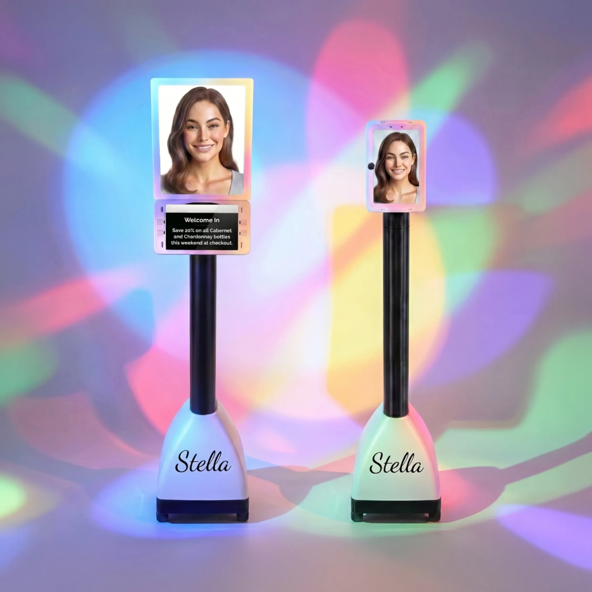
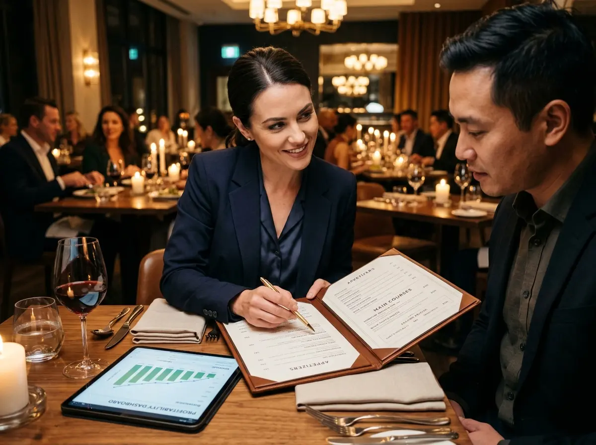
Menu design gets customers to order better. But what about everything that happens before they sit down, and after they leave? That's where Stella, the AI robot employee and phone receptionist, quietly becomes one of the more interesting tools in your arsenal. Standing inside your location as a friendly, conversational kiosk, Stella can proactively highlight your featured items — including those high-margin dishes you've carefully positioned on your menu — before customers even open the menu. Think of her as a host who always remembers to mention the specials, and never gets distracted by a side conversation near the wait station.
On the phone side, Stella answers calls 24/7 and can communicate current promotions, take reservations, and answer questions about your menu — reinforcing the same strategic messaging you've built into your physical menu design. If a customer calls to ask what's good tonight, Stella doesn't say "uh, everything's pretty good." She highlights what you've told her to highlight. That consistency across in-person and phone touchpoints is something most restaurants don't think about until they realize how many revenue opportunities slip through a distracted front-of-house team.
Tracking What's Working and Iterating Like a Pro
Menu Engineering: The Matrix You Actually Need
Menu engineering is the process of categorizing every item on your menu by two variables: popularity and profitability. The classic framework, developed by Michigan State professors Donald Smith and Michael Kasavana, creates four categories: Stars (high popularity, high profit), Plowhorses (high popularity, low profit), Puzzles (low popularity, high profit), and Dogs (low popularity, low profit).
Your Stars should be prominently featured and never messed with. Your Plowhorses need cost engineering — either raise the price slightly, reduce the portion, or swap in a lower-cost ingredient without affecting the experience. Your Puzzles need better placement and better descriptions; they're profitable but nobody's ordering them yet. And your Dogs? Have a quiet conversation with your chef. It's time.
Run this analysis quarterly. Your menu isn't a permanent document — it's a living business tool. Seasonal ingredient costs shift, customer preferences evolve, and what was a Star in January might be a Plowhorse by June. Treat your menu with the same analytical rigor you'd apply to your labor costs or your marketing spend, and it will reward you accordingly.
Testing Changes Without Burning Down Your Brand
Small changes, tested carefully, yield reliable data. When you update your menu, change one or two things at a time — a repositioned item, a revised description, an adjusted price. Then track the numbers. Most restaurant POS systems give you more than enough data to see whether a change moved the needle on a specific item's sales volume. If you changed three things at once and your revenue went up, you won't know why. And "I think it was the duck description" is not a repeatable business strategy.
Some operators test seasonal menus or limited-time offers as a lower-stakes environment for experimenting with new items, new pricing structures, or new categories. If a LTO item becomes a consistent top seller, it earns a permanent spot. If it doesn't move, it disappears gracefully after the season ends. This approach keeps your core menu tight while giving you real-world data on what your specific customer base actually responds to.
Quick Reminder About Stella
Stella is an AI robot employee and phone receptionist that works inside your business location as an engaging kiosk — greeting customers, promoting specials, and answering questions — while also handling phone calls around the clock with full knowledge of your offerings, hours, and policies. She's available for $99/month with no upfront hardware costs and no days off. If menu psychology is about shaping the customer's experience before they decide, Stella is the voice that starts that conversation.
Put It Into Practice Starting This Week
Menu psychology isn't magic, and it's not manipulation — it's applied understanding of how people actually make decisions. The gap between a menu that's merely functional and one that actively works for your business is filled with intentional choices: where items live on the page, how they're described, what's placed next to what, and how often you analyze and update the whole thing.
Here's where to start this week:
- Audit your current menu layout. Identify your sweet spot and check whether your highest-margin items are living there.
- Run a basic menu engineering analysis. Pull your sales data and categorize every item as a Star, Plowhorse, Puzzle, or Dog.
- Rewrite three item descriptions using sensory, evocative language and see if those items' sales move within two weeks.
- Remove dollar signs and eliminate the price column on your next menu reprint — then track average ticket over the following month.
- Introduce one anchor item priced significantly above your typical range to recalibrate perceived value across the section.
Your menu is one of the most cost-effective marketing tools you already own. It just needs a little psychology to start pulling its weight. Tweak it deliberately, measure the results honestly, and update it consistently. Your customers will feel better about their choices, your kitchen will run more efficiently, and your margins will thank you — probably without sending a card, but you'll see it in the numbers all the same.