Your Store Layout Is Either Selling for You — or Silently Killing Your Sales
Here's a fun thought experiment: imagine hiring a salesperson who never speaks, never moves, and just sort of... stands there. You'd fire them immediately, right? Yet thousands of clothing boutique owners essentially do this every day with their store layout. The fixtures, the flow, the lighting, the placement of that beautiful new arrivals rack — all of it is either actively working to convert browsers into buyers, or it's quietly letting them walk out empty-handed.
The good news? Your store layout is one of the most powerful — and most underutilized — sales tools you have. Research from the Retail Doctor and various consumer behavior studies consistently shows that shoppers make purchasing decisions within the first 90 seconds of entering a store, and the physical environment is a major driver of those snap judgments. So if your layout is an afterthought, your revenue probably reflects that.
This guide is for boutique owners who are ready to treat their floor plan like the silent salesperson it truly is — one that can greet, guide, upsell, and close without ever asking for commission.
The Psychology Behind How Shoppers Move (And How to Use It)
You can't design a high-converting boutique layout without first understanding how human beings actually behave when they walk into a store. Spoiler: it's not as rational as you'd hope. Shoppers are creatures of habit and instinct, and your layout should be designed around their natural tendencies — not against them.
The Decompression Zone: Don't Waste Your Entrance
The first five to fifteen feet inside your front door is called the decompression zone, and retail experts like Paco Underhill (author of Why We Buy) have studied it extensively. When customers first enter, they're transitioning from the outside world — mentally adjusting, slowing down, taking in the space. They almost never notice or interact with products placed in this zone.
This means that gorgeous display you lovingly arranged right by the front door? Most people are walking past it without registering it. Instead, use the entrance area for visual impact — a compelling window display, clear signage, or a strong brand statement that sets the mood. Save your actual merchandise and promotional displays for just beyond that transition zone, where customers have fully arrived and are ready to engage.
The Counterclockwise Truth: Guiding the Natural Path
Studies show that the majority of shoppers — particularly in Western countries — naturally veer to the right when entering a store and tend to move counterclockwise. This isn't a conspiracy; it's just human instinct. Designing your store layout to complement this natural flow means shoppers will organically encounter your merchandise in the order you intend.
Practically speaking, this means placing your most visually striking and high-margin items to the right of your entrance, along the natural path of travel. Your newest arrivals, seasonal collections, or highest-markup pieces deserve that prime real estate. Think of your store as a story — every section the customer moves through should build toward a satisfying conclusion at the register.
Strategic Placement of Your Power Products
In grocery retail, they put milk at the back because everyone needs it and it forces you past everything else. Your boutique has its own version of "milk" — it might be your most popular denim, a bestselling accessory, or a staple piece that keeps customers coming back. Place these destination products toward the middle or back of the store, and use your high-margin impulse items (scarves, jewelry, belts, gift cards) near the register to capture last-minute add-ons. This single tactic alone can meaningfully increase your average transaction value.
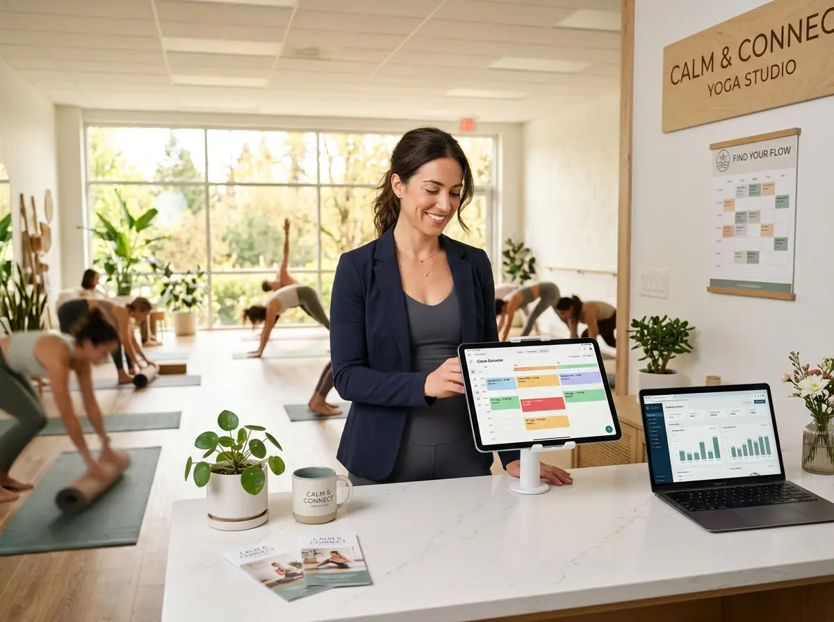
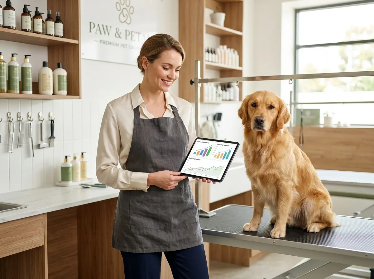
Enhancing the In-Store Experience Without Burning Out Your Staff
A great layout sets the stage, but the experience your customers have while they're in the store — especially during busy hours — is what determines whether they buy, return, and refer friends. One of the most common complaints from boutique staff is that they're constantly pulled in multiple directions: folding, ringing up sales, answering the same questions on repeat, and trying to actually help customers all at once. Something inevitably suffers.
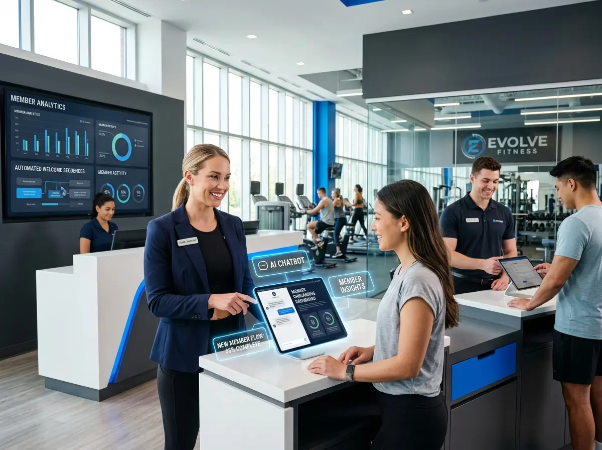
Where Technology Fits Into Your Boutique Floor Plan
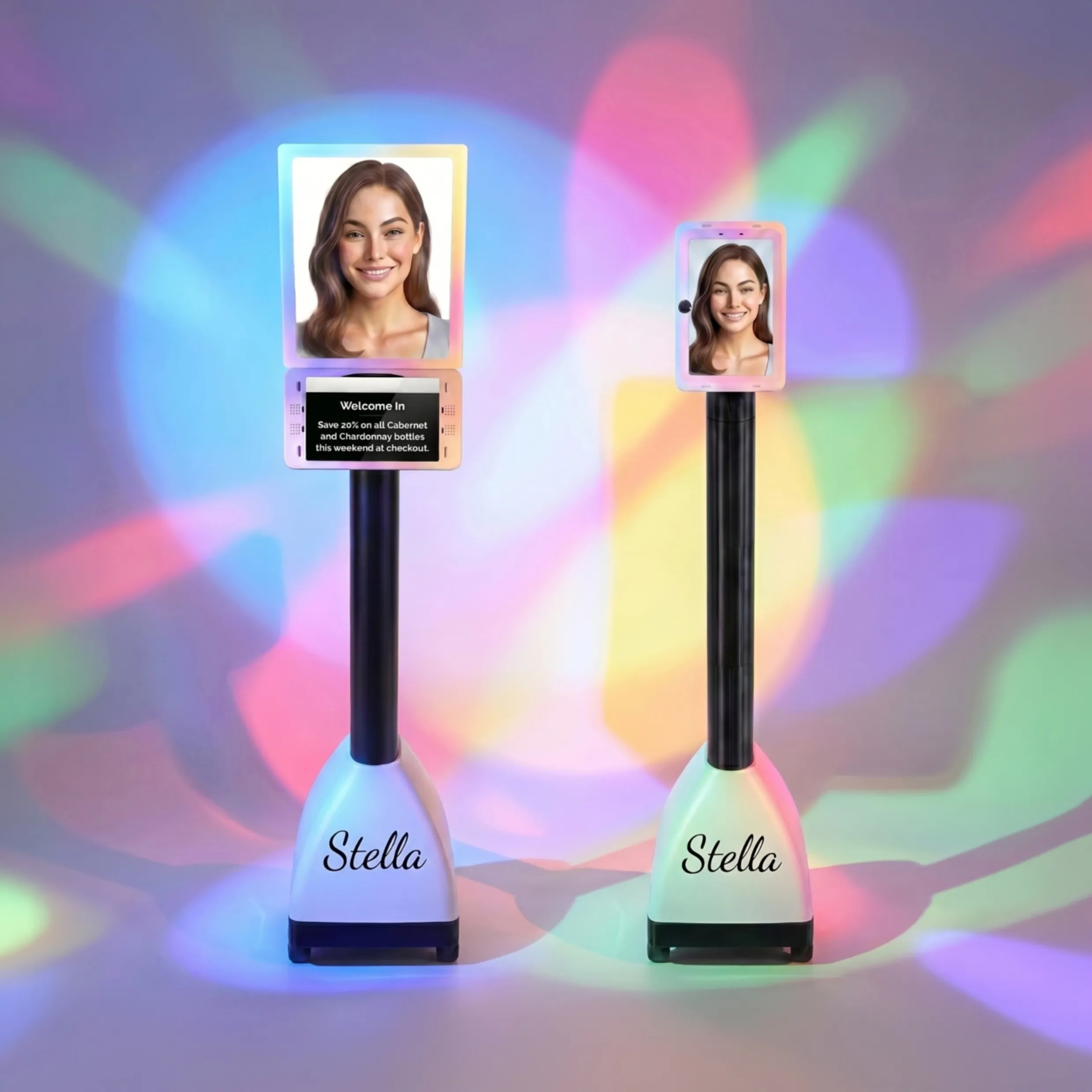
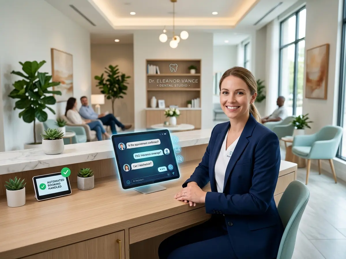
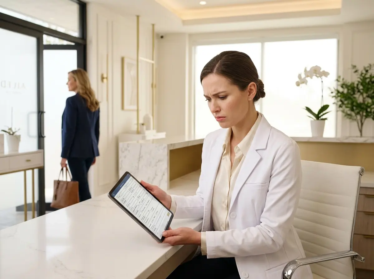
This is where Stella, the AI robot employee and phone receptionist, genuinely earns her keep in a boutique setting. Standing as a human-sized, friendly kiosk inside your store, Stella greets every customer who walks in, answers questions about products, sizing, promotions, and store policies — all without pulling your team away from what they do best. She can proactively highlight current deals and even upsell and cross-sell by recommending complementary pieces, essentially acting as a knowledgeable sales associate who never gets tired and never calls in sick.
Beyond the floor, Stella also answers your phone calls 24/7 with the same product and business knowledge she uses in the store. For boutiques that field calls asking about hours, return policies, and whether that green wrap dress is still in stock, this is a meaningful operational upgrade that frees your in-store staff to focus on the customer standing right in front of them.
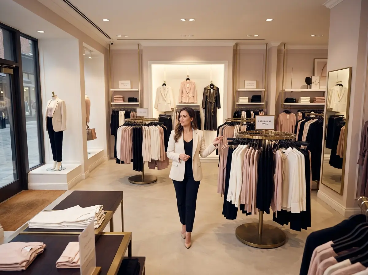
Visual Merchandising That Actually Moves Product
Layout creates the path; visual merchandising is what stops shoppers in their tracks along that path. The best boutiques treat every display like a curated editorial moment — and it pays off. According to the National Retail Federation, effective in-store displays can increase sales of featured products by up to 540%. That's not a typo. Half a thousand percent. So yes, this is worth caring about.
The Rule of Three and Vertical Merchandising
Designers have known for centuries that the human eye finds groupings of three inherently pleasing. In retail, this translates to displaying items in odd-numbered groupings — three heights, three color families, three coordinating pieces styled together as an outfit. Vertical merchandising (arranging products from floor to ceiling in a coordinated way) draws the eye upward, makes your space feel larger, and helps shoppers quickly understand how pieces work together. Rather than folding five identical blouses on a shelf, style one on a mannequin, hang two on a rack at varying heights, and fold two on a nearby table with an accessory. You've turned a product into a story.
Color Blocking and the Art of the Focal Point
Color is one of the fastest ways to communicate mood, brand identity, and product story. Color blocking — grouping items by color family rather than style or size — creates visually clean displays that are easier for customers to shop and more satisfying to look at. Every boutique should also have clearly defined focal points: the one display in each section that immediately draws the eye and anchors the space. This is typically your best-looking, most aspirational styling moment. It doesn't need to be your highest-priced item — it needs to be the thing that makes someone stop walking and think, "I need to try that on."
Lighting as a Merchandising Tool
If your store relies solely on overhead fluorescent lighting, we need to have a gentle but firm conversation. Lighting in a boutique isn't just functional — it's directional and emotional. Use accent lighting to spotlight key displays and new arrivals, warm bulbs in fitting rooms (your customers will love you for this), and layered lighting overall to create depth and ambiance. Customers who feel comfortable and flattering in your fitting room are customers who buy. It really is that simple, and it really does get overlooked that often.
Quick Reminder About Stella
Stella is an AI robot employee and phone receptionist designed to work inside your physical store as a friendly, knowledgeable kiosk — and to answer your phones around the clock with the same business expertise. At just $99/month with no upfront hardware costs, she's built for boutiques and small businesses that want a reliable, professional presence without the overhead of additional staff. Easy to set up, always ready, and never in need of a lunch break.
Putting It All Together: Your Next Steps
A high-converting boutique layout isn't about spending a fortune on a redesign. It's about being intentional — understanding how your customers move, making sure your best products are positioned where they'll actually be seen, and creating visual moments that stop the scroll (metaphorically speaking) on your sales floor.
Here's a simple action plan to get started:
- Walk your own store as a customer. Enter through the front door and move naturally. What do you notice first? What do you walk past? Where do you stop? Take notes without judgment.
- Audit your decompression zone. Clear it of merchandise you expect to sell and replace it with visual brand impact.
- Map your customer flow. Identify the natural counterclockwise path and ensure your highest-margin products sit along that route.
- Rebuild three displays using the rule of three and vertical merchandising. Style complete outfits, tell a visual story, and create a clear focal point in each zone.
- Evaluate your lighting. At minimum, add accent lights to your two or three most important displays and swap out fitting room bulbs for warm-toned options.
- Consider your staffing gaps. If your team is constantly stretched between phone calls, customer questions, and operations, look at tools like Stella to fill those gaps without adding payroll.
Your store layout is working either for you or against you — there is no neutral. The boutiques that treat their physical space as a strategic sales environment consistently outperform those that treat it as mere storage with good lighting. Make every square foot count, give your customers a journey worth taking, and let your silent salesperson do the heavy lifting.